

CASE STUDY OF A BESPOKE COMMISSION - ALICE IN WONDERLAND - PART1
Last summer I was contacted by a bride to design stationery for her wedding taking place the following summer. The first brief was to create a day and evening invitation pack based loosely on the theme of Alice in Wonderland and incorporating the colours of teal and turquoise . . .
Rather than follow an obvious Disney-fied fairytale look, we discussed staying true to the spirit of the original Victorian novel by Lewis Carroll with a hint of Vintage Tea Party styling. My full bespoke service includes up to 3 design concepts and samples to choose from. From there, the chosen design is worked up fully and adapted as required to produce a full set of proofs until ready for production.
Originally I came up with three concepts within 3 pricing tiers:
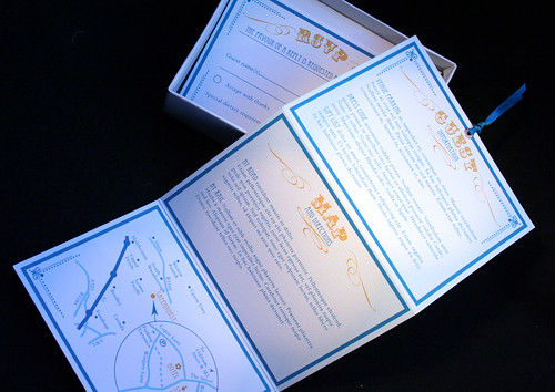
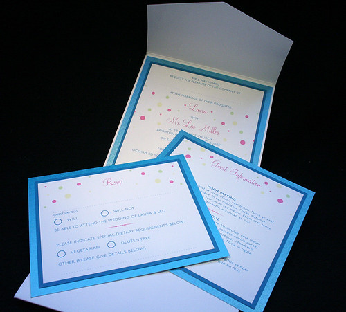
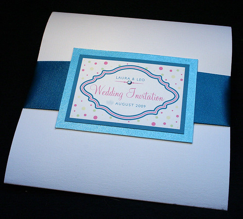
1 - A portfolio pack containing the invitation, an information and map enclosure and RSVP postcard.
The style was light and fresh with a 50's kitsch feel leaning toward vintage tea party rather than the book.
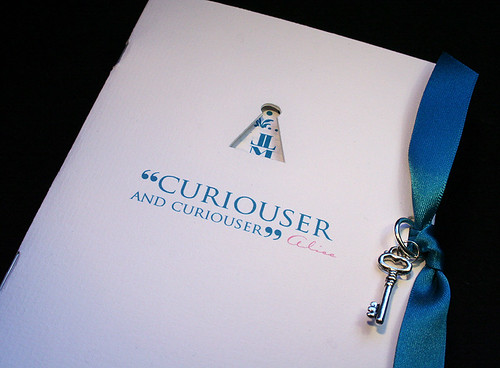
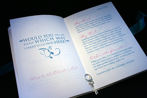
2 - A booklet containing the invitation and subsequent pages of information and maps with a separate rsvp pocket. This was designed in thorough detail with more than a nod to the Alice story.
The cover had a keyhole cut through enticing the reader with a hint of the foliage graphics beneath. Quotations from the book were used to introduce relevant sections such as directions. The typography was quirkly set in contrasting sizes echoing the constant change in size Alice experiences and finished with a teal ribbon and silver plated key charm. Even the initials of the couple hints at the shape of the Mad Hatter's hat!
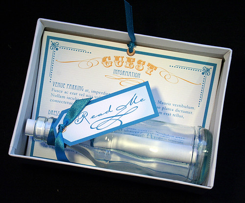
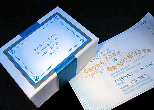
3 - A boxed package containing a tiny glass bottle with a miniature scroll invitation and fold out enclosures. The bottle had a "read me" tag tied around its neck. The graphics and typography were purposely styled with a Victorian look.
The concept samples are shown above.
No comments:
Post a Comment